
Where it is
ScreenMarketplaceBasic
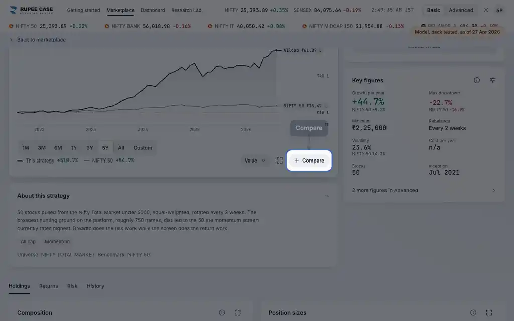
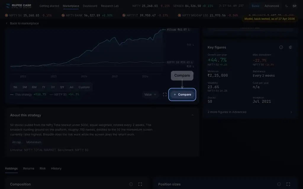
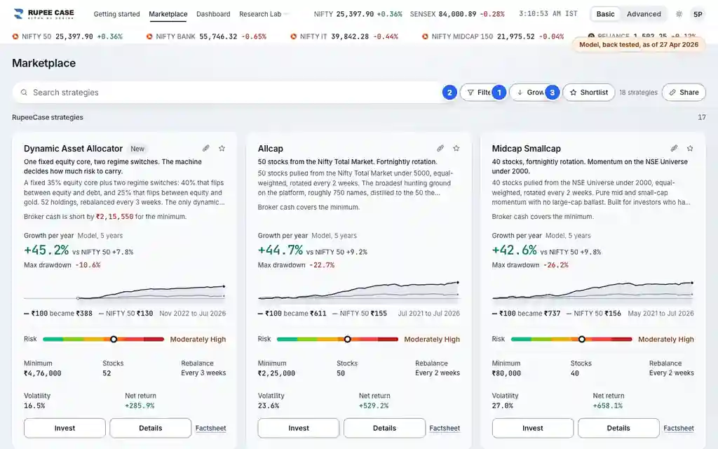
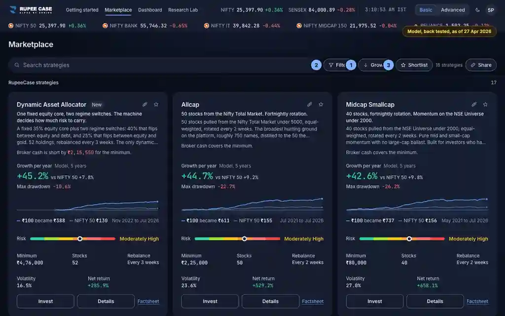
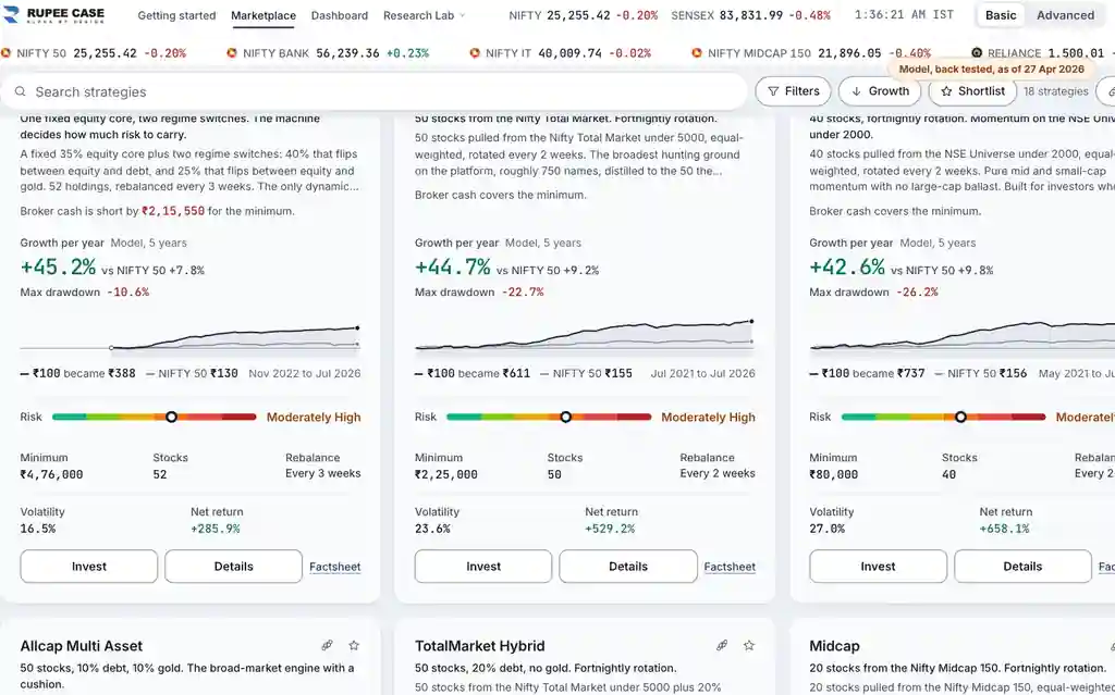
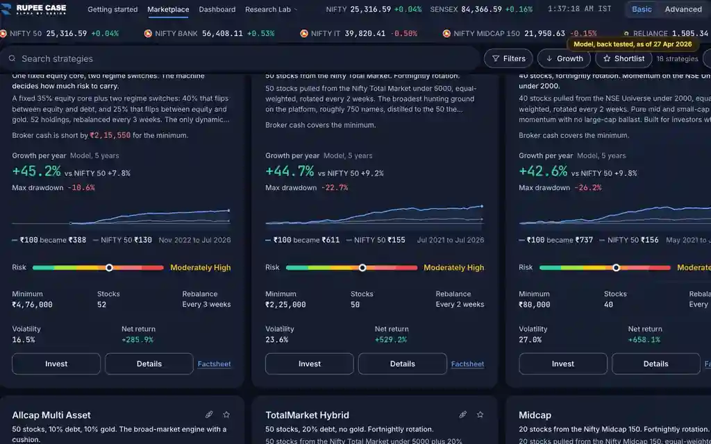
On the Marketplace: the compare button on each card (desktop), or the Select chip and then a tap on each card (phone; a long press works too). The tray at the bottom opens the comparison. Basic and Advanced.
What it means
The comparison sheet draws each strategy's model growth from 100 at a common start, on a log scale, with 1Y, 3Y, 5Y and All chips for the chart. Below it, rows set the card figures side by side: growth a year, the benchmark, max drawdown, risk, minimum, stocks, rebalance, net return and volatility; Advanced adds alpha, Sharpe, inception and universe. A check mark sits on the better value in each row that has a direction.
The formula
Each line is rebased to 100 at the first month every pick shares. The rows are the card figures: model, full history, after estimated charges. Higher is better for growth, net return, alpha and Sharpe; smaller is better for max drawdown and volatility.
Line = model value / model value at the common start x 100 (log scale)
Rows = card figures, full history, after estimated charges; the chips do not change them
Check mark: highest growth, net return, alpha, Sharpe; smallest fall and volatility; none on a tie
Worked example
Example only
- A: 100 became 600 since the common start; B: 100 became 400
- Max drawdown A -25%, B -18%: the check mark goes to B
- Growth a year A 40%, B 30%: the check mark goes to A
How to read it
- Read a row across: the check mark marks the better value on that row only.
- On a log scale equal steps are equal percentage moves.
- "Growth a year" here is the card's "Growth per year".
Watch out
- The rows ignore the 1Y, 3Y and 5Y chips: they are always the full history.
- Lines start at the first month every pick shares, so a newer strategy shortens the chart.
- A check mark compares past model figures; it is not a recommendation.
Transcript
The video has no sound. These are its on screen captions, chapter by chapter.
- 0:00Where it is. On a phone, Select starts picking strategies to compare.
- 0:18What it means. Each line starts at 100 at the first month all picks share, on a log scale.
- 0:50Worked example. Worked example, example only: A: 100 became 600 since the common start; B: 100 became 400. Max drawdown A -25%, B -18%: the check mark goes to B. Growth a year A 40%, B 30%: the check mark goes to A.
- 0:56How to read it. 1Y moves the chart. The rows below stay full history.
- 1:18Watch out. Watch out: The rows ignore the 1Y, 3Y and 5Y chips: they are always the full history. Lines start at the first month every pick shares, so a newer strategy shortens the chart. A check mark compares past model figures; it is not a recommendation.
Terms in this tutorial
- CAGRCompound Annual Growth Rate.
- drawdownThe peak-to-trough decline during a specific period.
- volatilityHow much returns fluctuate.
- backtestSimulation of a strategy on historical data to estimate past performance.